Computer-aided layout
Started: 2021-07-03 22:31:43
Submitted: 2021-07-04 12:23:31
Visibility: World-readable
Modeling the house and its furniture
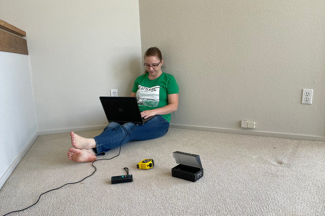
The first thing Kiesa did when we took possession of our new house in Santa Cruz was to spend the entire weekend measuring everything and building a series of elaborate SketchUp models for most of the rooms in the house to help us organize the furniture before moving in.
One interesting quirk of our new house is that it has many weird angles. Previously we've only had to deal with, say, one corner cut off to fit a fireplace into the family room (as was the case in our house in Boulder, requiring some careful organization to get everything to feel right in the room); this house had an octagonal living room and a pentagonal family room, and Kiesa went through a bunch of iterations in SketchUp to get something that worked.
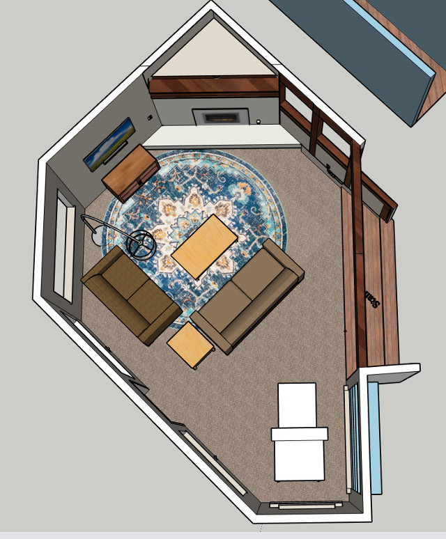
We designated the ground-floor room as the living room. Kiesa struggled to come up with a good way to manage the various potential focal points in the room, while still finding a credible place to put the television. Eventually she found a round rug and ordered it to be delivered to our new house and included it in the model. (The one caveat is that the entertainment cabinet we've been using for years no longer fits in the space we have available, so it's been re-designated as a console table in the dining room.)
I used the models to show the movers where we hoped everything would go, and as they pulled each piece of furniture off the moving trucks they remembered where everything was supposed to go (better than I remembered, and I'd been looking at these drawings in progress for weeks). I was impressed by the results as they placed furniture in the right place, proving the plan and all the time Kiesa spent rearranging virtual furniture.
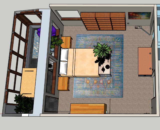
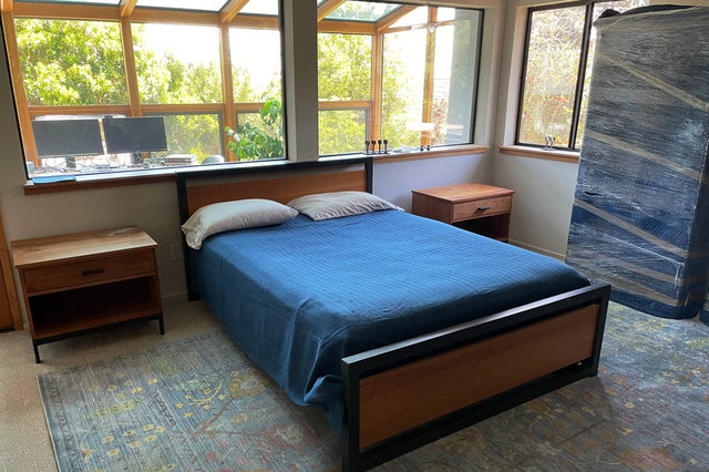
Despite my hopes for my new house, I ended up with a work-from-home office that was also my bedroom again. Kiesa put her desk in the sun room adjacent to the bedroom, which mostly works except that the room is basically a greenhouse, with windows in front and above the desk (and the audio isolation between our desks is almost non-existent to the point where we might as well be sharing a single open-plan office).
While arranging the furniture in the model of the house, Kiesa ran into places where there were gaps in the corners between the furniture, so she filled them with plants. We don't have the plants shown in the model above, but that's a problem I'm willing to solve.
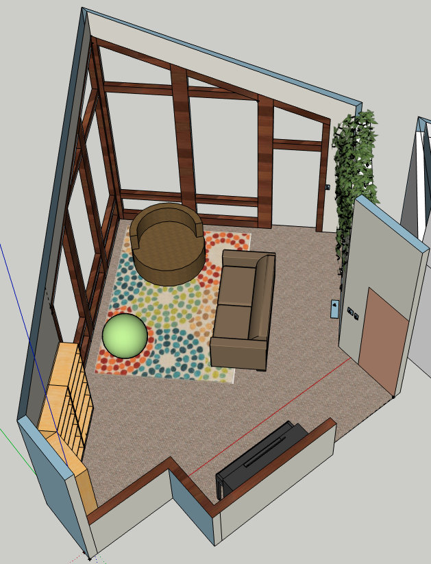
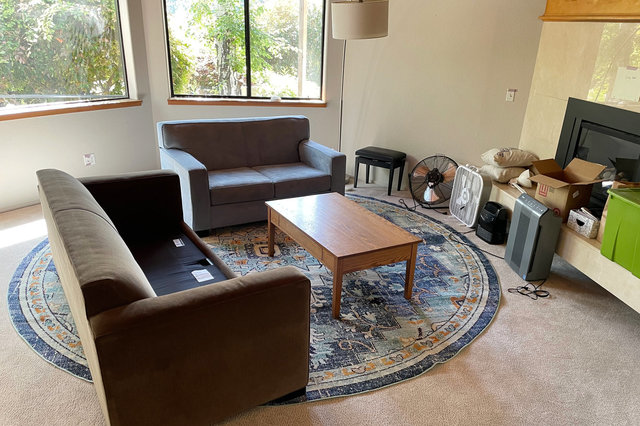
We designated the upstairs room with the dramatic east-facing windows as the "family room". Here we used one of our existing rugs to outline a sitting area that aligned with the dramatic windows, even though the windows are 45° out of alignment with the rest of the house.
While the movers were unloading furniture into the house, one of them looked at the family room and commented how well our furniture fit inside the house, as if it were meant for the house. I had to laugh because this was the result of hours of work to model the house and arrange the furniture inside the house; but the end result was that everything fit where it was supposed to (no furniture got stuck on the lower level because — in this house — our stairs are large enough to carry everything upstairs). The movers seemed happy that they didn't have to carry furniture around between multiple rooms to try to get it to fit. We will still iterate on the arrangement of the furniture, but it looks good so far.
